 One of the most important aspects of good photography is the composition of the image, either in the viewfinder of the camera, or in the cropping and scaling of the image afterwards.
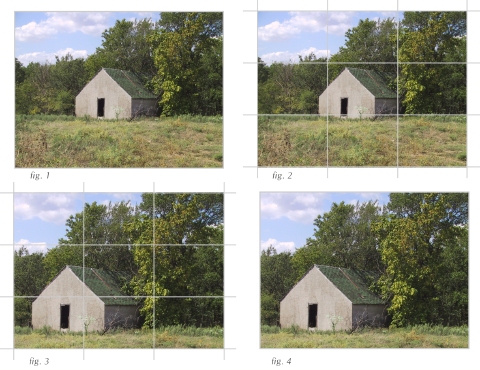
In this example, have taken an image (fig. 1) and shown what the eye is immediately drawn to, the outbuilding. However, the subject is fairly centered, which can make for an uninteresting composition.
In Figure 2, have overlaid a grid that breaks the image down into one-third squares.
Using the grid, I have rescaled the image, and placed the subject in an area that occupies either the northwest, northeast, southwest, or southeast two-thirds quadrant of the image area. In this example, have chosen the southwest quadrant (fig. 3). The final edit is displayed in Figure 4.
Comparing the images in figures 1 and 4, we now see that by moving the subject away from dead center, the overall image now shows greater “flow” and visual appeal.
